Back to work
Hooga· 2026

Hooga

Hooga is a new experience in the purchase of toys and collectibles.

Branding
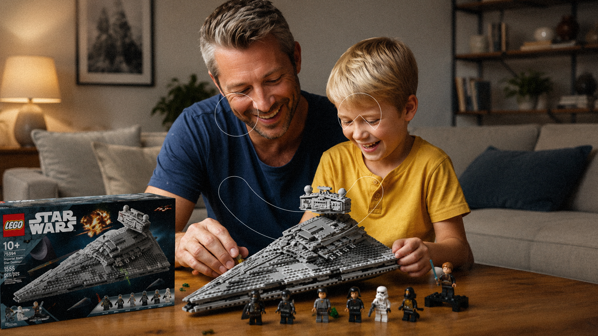
Hooga cover
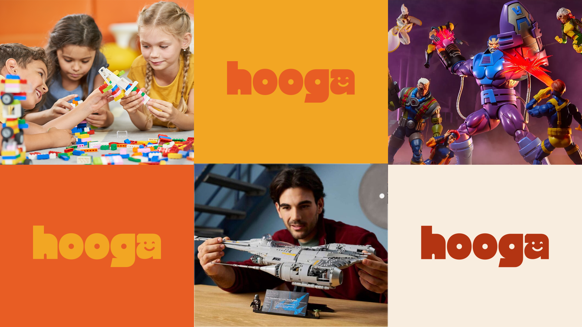
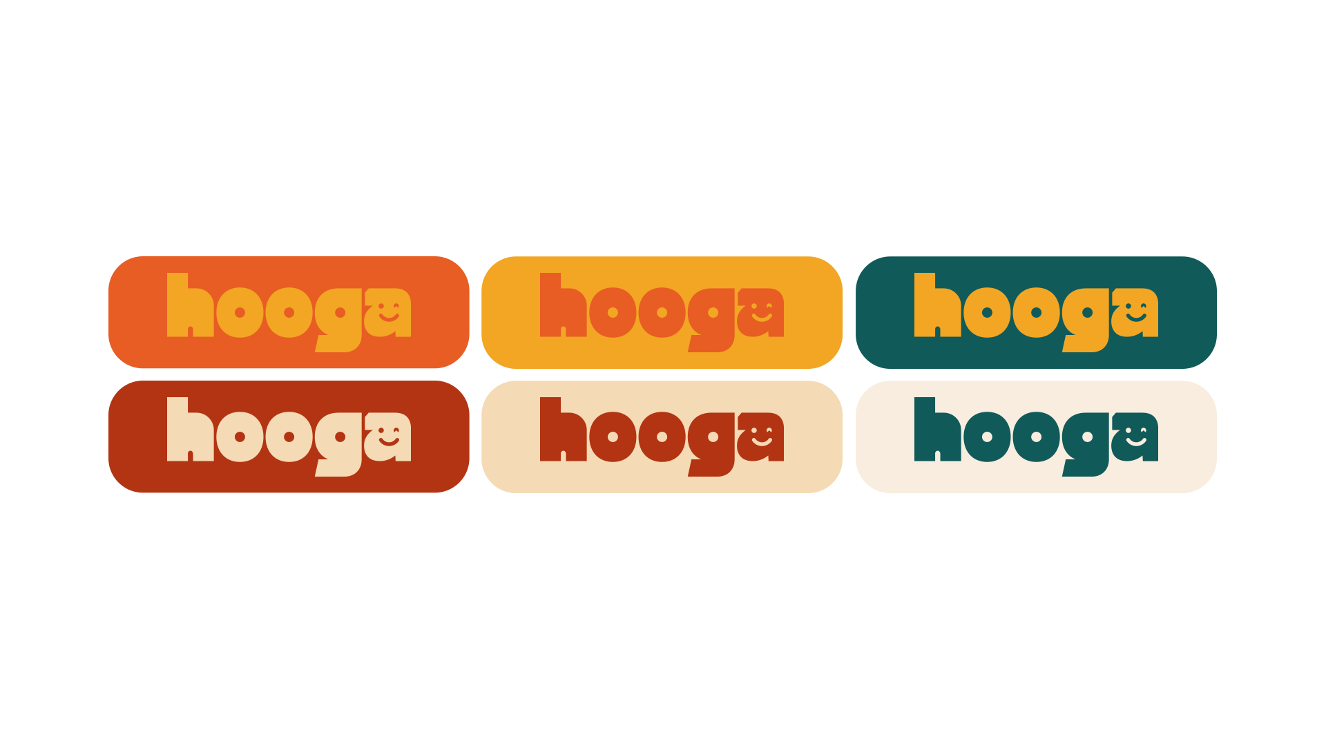
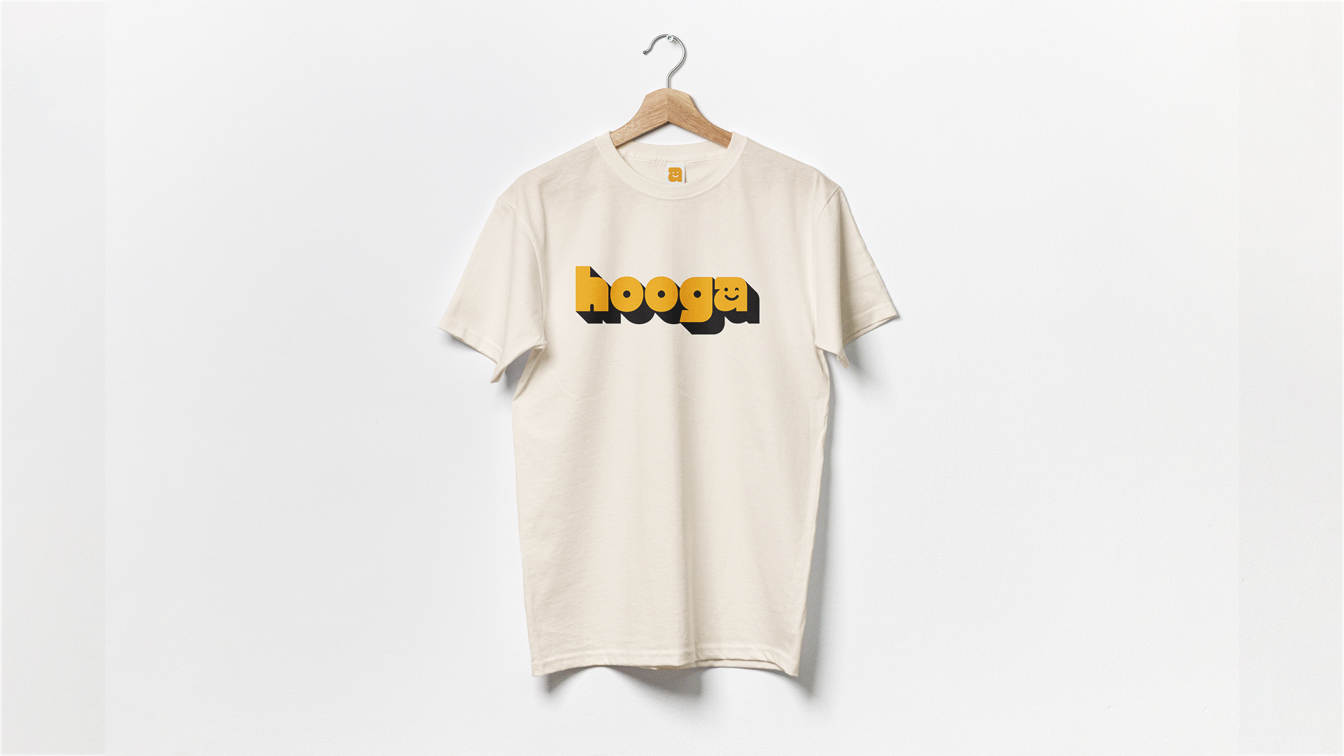
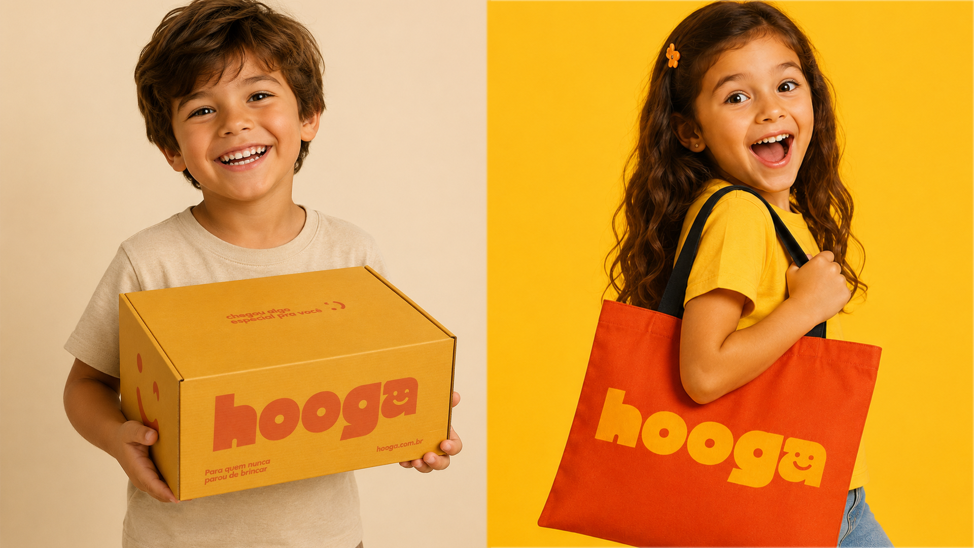
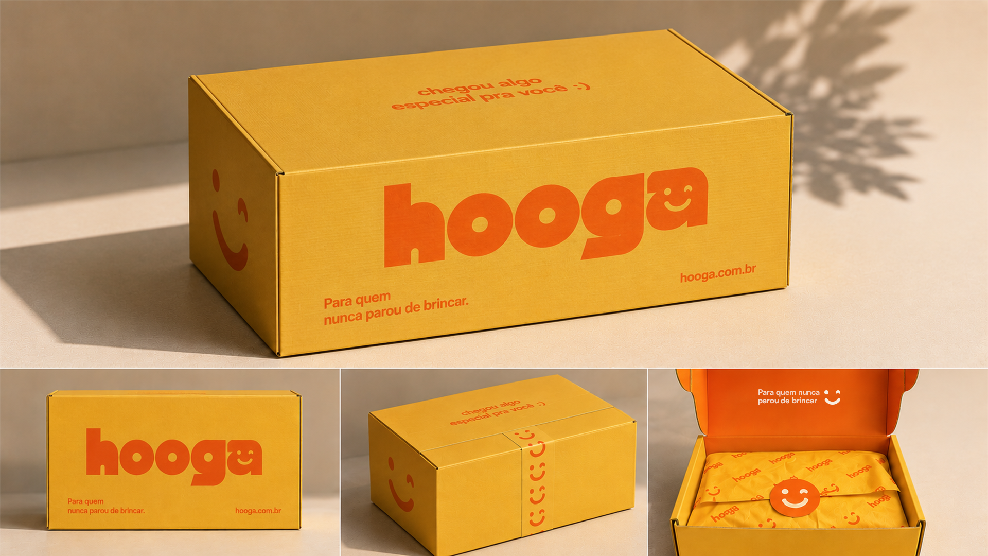
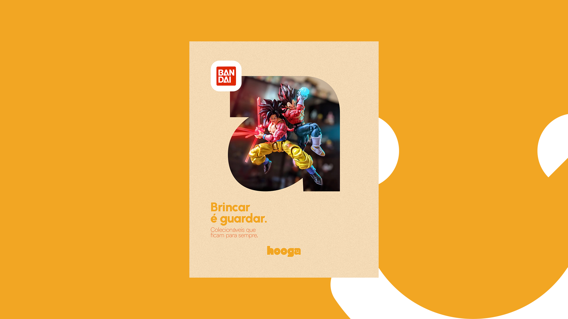
Hooga comes to disrupt the experience of getting and sharing a new toy. A new and better customer experience that needs a different visual identity. The company has been focusing on special edition of LEGOS and collectibles from different toy collections and it aims to bring disruption in other areas of the marketplace. Project Leader: Joao Pedro Danhoni Visual Designer: Ricardo Ohara Tools: Adobe Illustrator and Figma
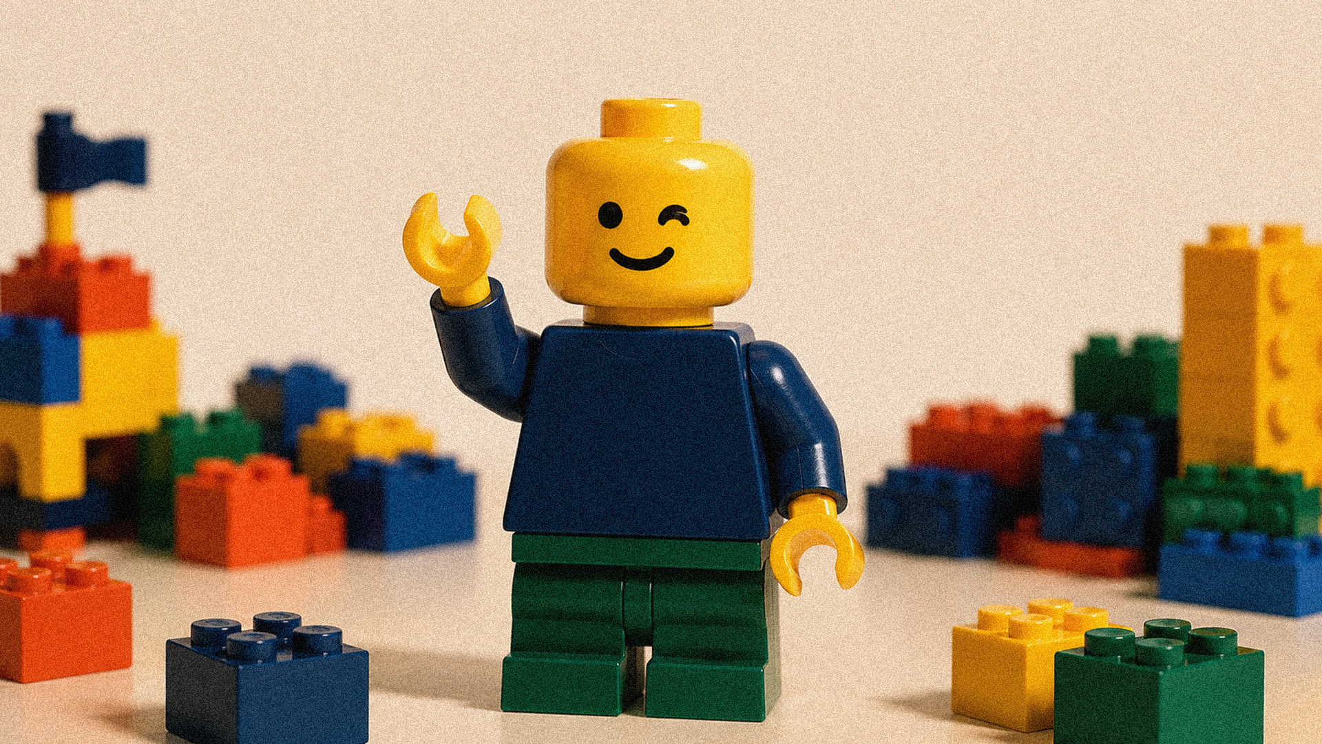
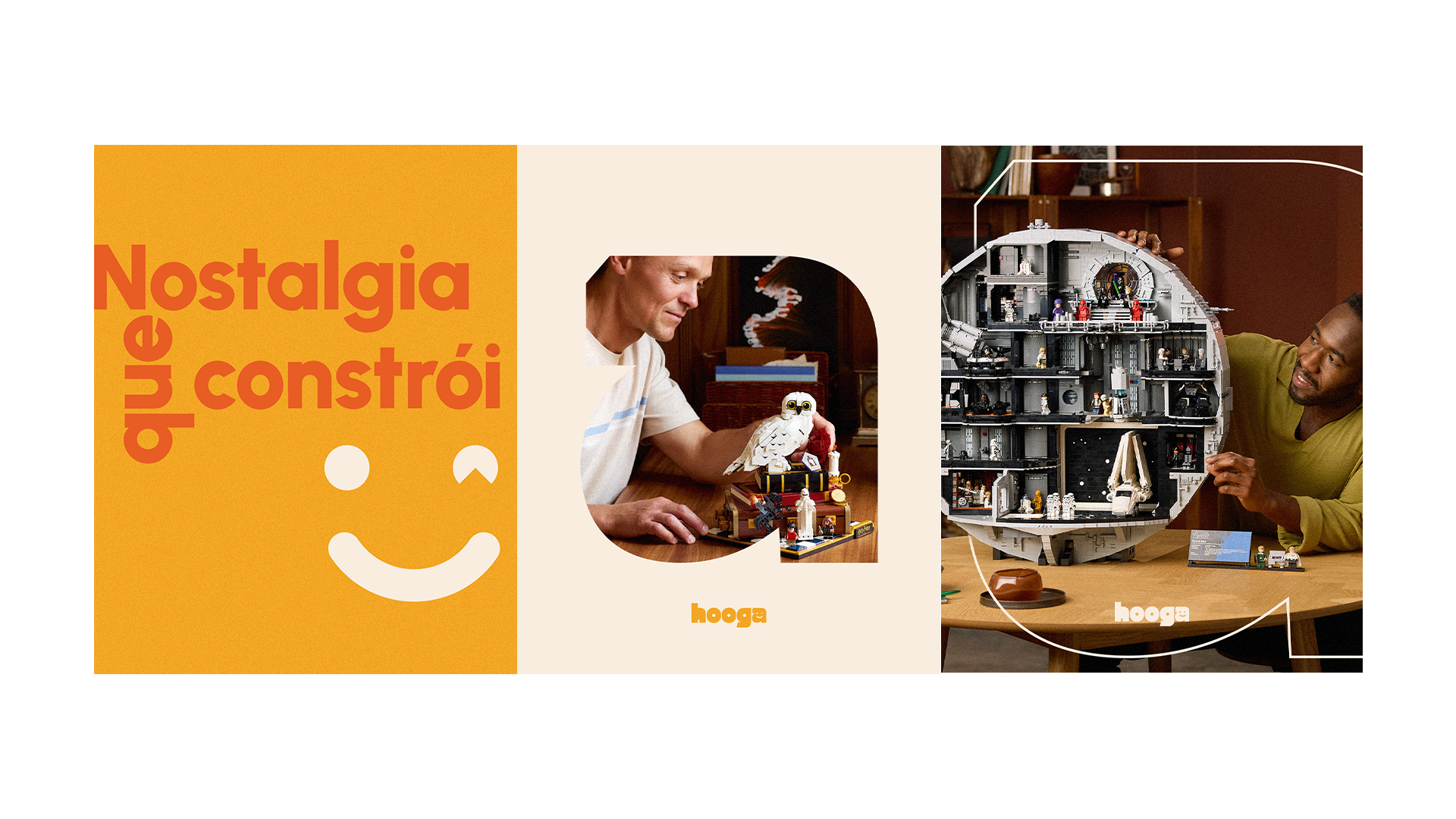
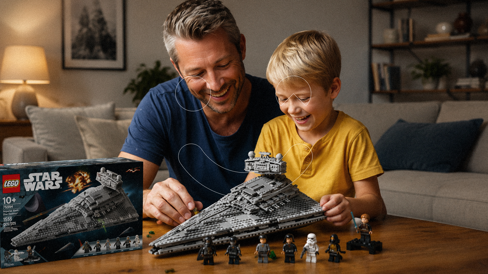
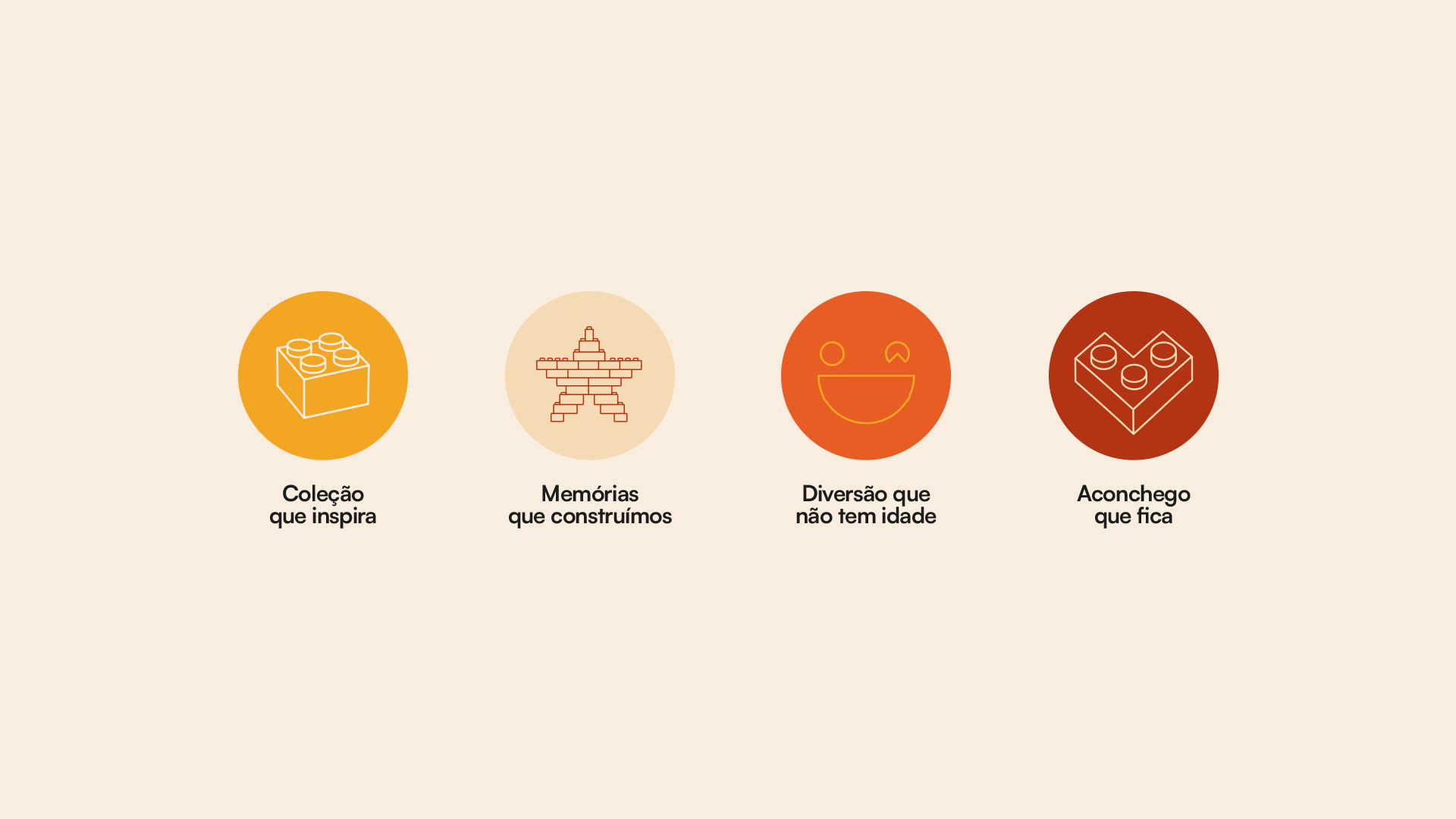
Hooga is a fonetic approach from the danish word Hygge, that means comfort, presence and belonging. It's the feeling of opening a box that smells like memory. It's the adult that assembles with the son, the collector that waits for the market to improve. It's not only a Toy Store. It's a place where you decide what to keep forever.
Where the "childhood" turns into investment. Where "playing" is an act of care.
Hooga — image 3
Hooga — image 4
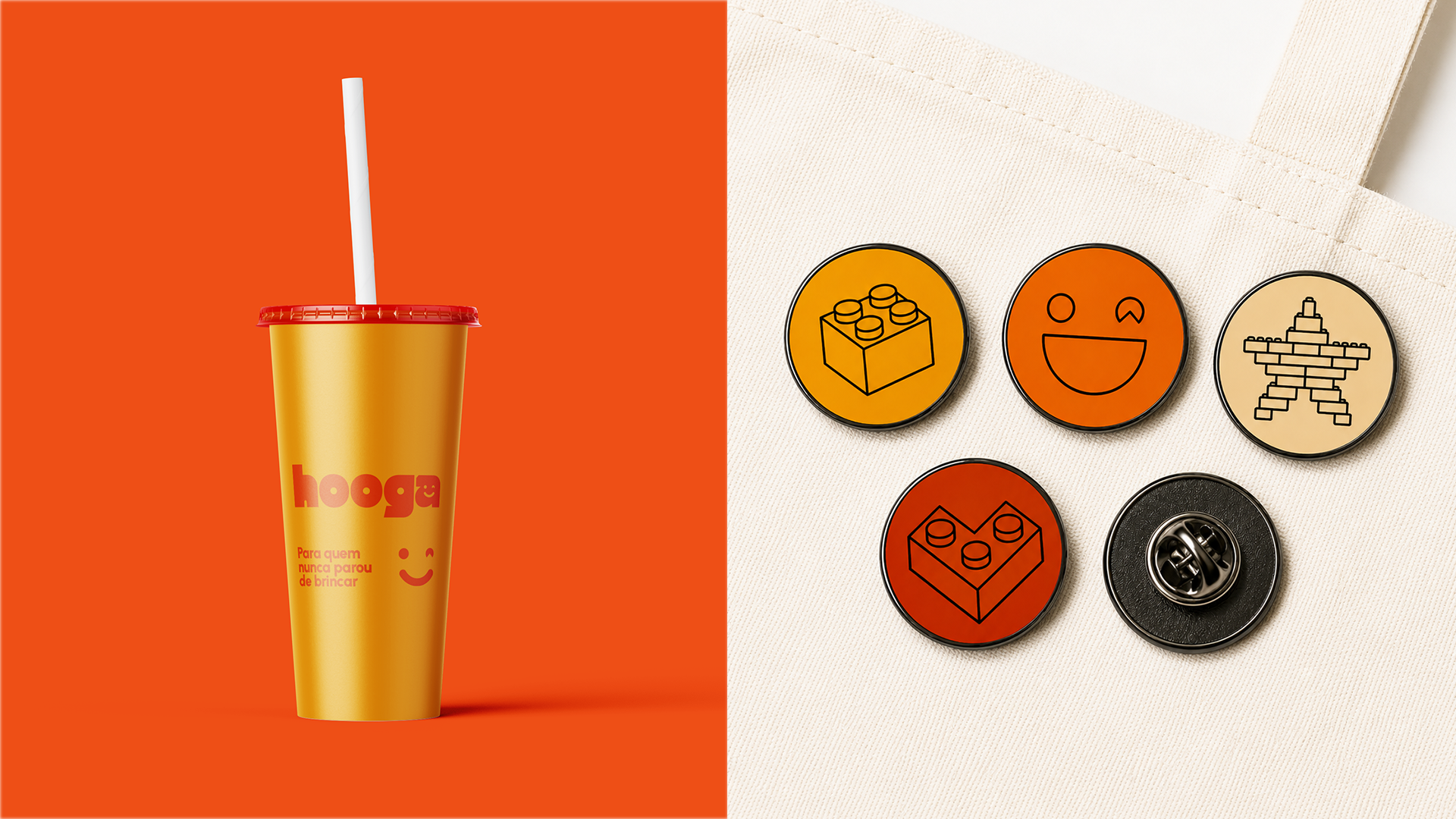
For those who never stopped playing!
Hooga — image 6
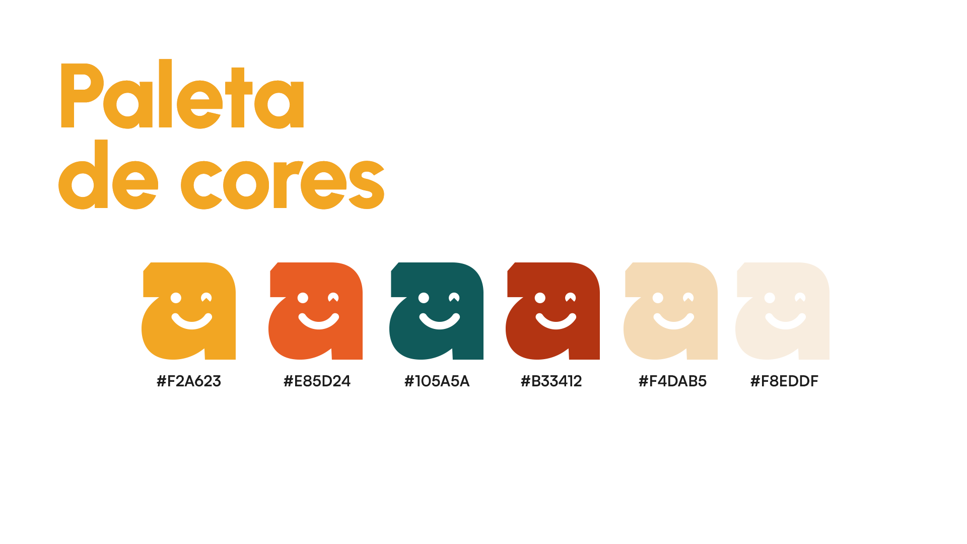
Color Paletts
Color Paletts
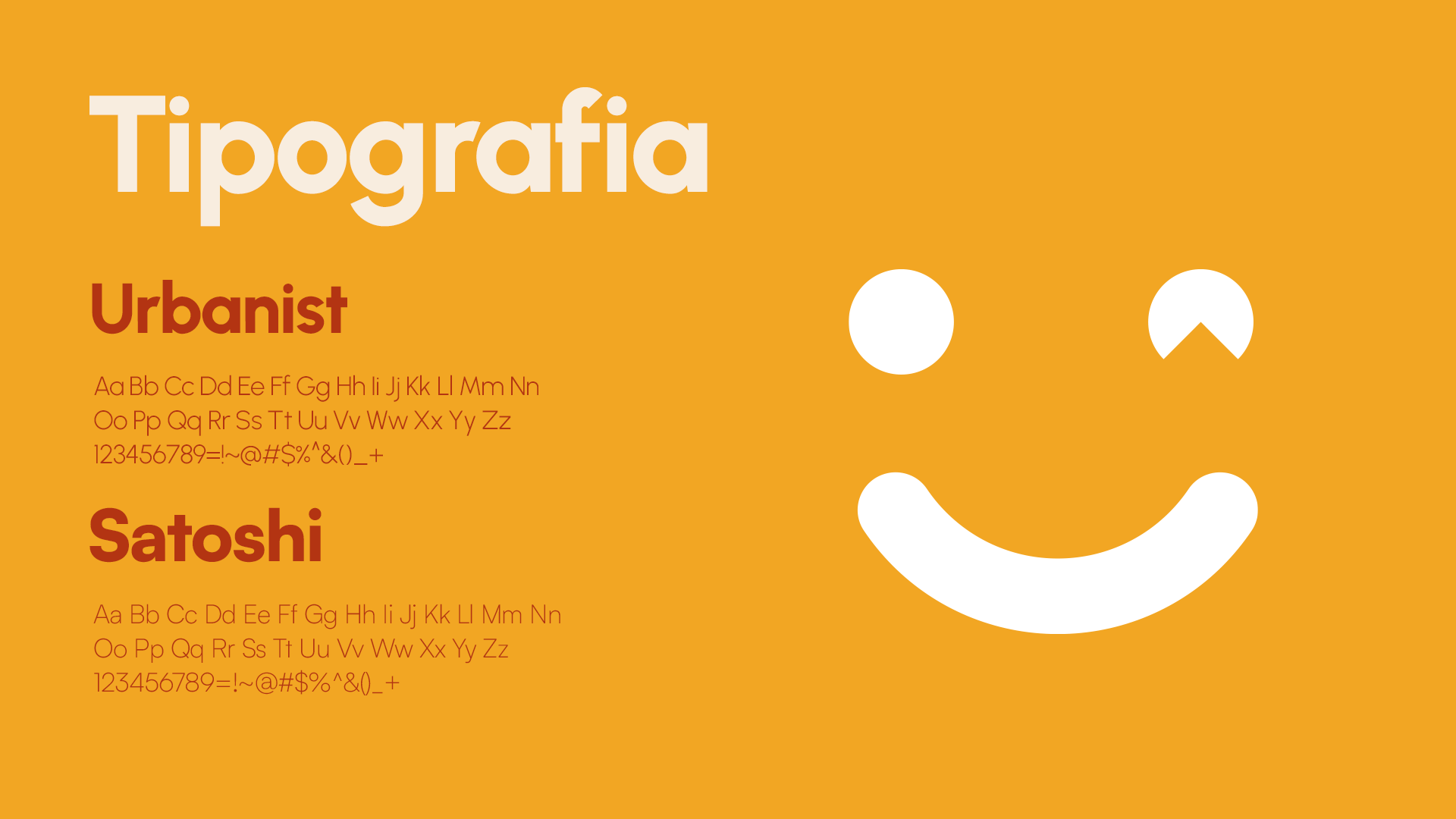
Typography.
Typography.
Hooga — image 9
Hooga — image 10
Hooga — image 11
Hooga — image 12
Hooga — image 13
Hooga — image 14
Hooga — image 15
Hooga — image 16
Hooga — image 17